Most creators approach YouTube thumbnail design by copying competitors, staying one step behind without understanding what actually drives clicks. The result: mediocre CTR, lost impressions, and videos that never get the algorithmic push they deserve.
YouTube confirms that 90% of best-performing videos use custom thumbnails, but custom alone doesn't guarantee effectiveness. This guide covers the thumbnail design principles that separate scroll-stoppers from scroll-pasts: the psychology of visual attention, composition frameworks that guide the eye, color theory that creates contrast, and the technical specs that ensure your work displays correctly across every device and surface.
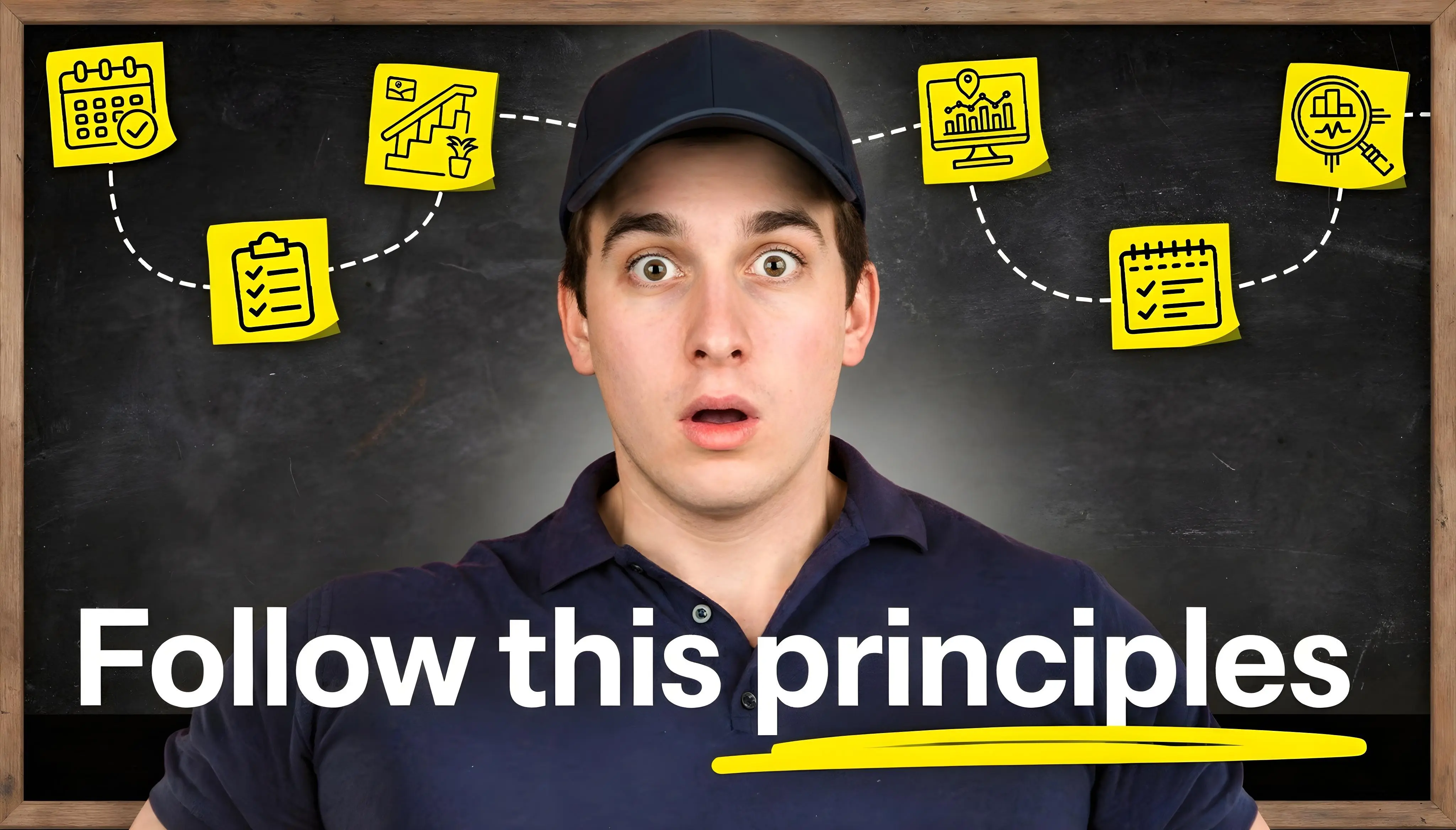
TL;DR:
-
Framework:
Use AIDA (Attention → Interest → Desire → Action) to structure your design
-
Simplicity rule:
Limit designs to 2-3 visual elements maximum for clarity
-
Color strategy:
Use complementary pairs and 4.5:1 text contrast ratios
-
Bottom line:
Keep to 3-5 words for readability, and test at 120-160px wide before uploading
Publish-ready thumbnail checklist
5-minute thumbnail build order
- Background - Choose or blur a contextual background
- Subject cutout - Extract and position your dominant element (40-60% of frame)
- Contrast check - Ensure subject pops against background (adjust saturation if needed)
- Text overlay - Add 3-5 words in bold sans-serif with outline/shadow
- Mobile test - Downscale to 120-160px wide and verify readability
YouTube thumbnail design: principles vs templates vs A/B testing
Templates speed up production and A/B testing reveals what works, but neither replaces understanding why certain designs perform.
Principles give you the mental models to create effective thumbnails from scratch, adapt templates intelligently, and interpret test results beyond surface-level "this version won."
Knowing the underlying psychology and composition rules means you can troubleshoot underperforming thumbnails, innovate beyond existing patterns, and make informed creative decisions when data is sparse or inconclusive.
How we validated these principles
These recommendations draw from YouTube's official creator guidance, WCAG accessibility standards, established color theory and visual design research, and analysis of thumbnail performance patterns across multiple content categories. Where specific numbers appear (like "30-40% negative space"), they represent practical starting points for testing rather than universal rules.
How psychology and visual attention drive thumbnail clicks
Viewers decide in under a second whether to click or scroll. That decision isn't random, it follows predictable patterns rooted in how the brain processes visual information. Understanding these patterns lets you design thumbnails that work with attention rather than against it.
The AIDA framework applied to thumbnail design
The AIDA framework (Attention, Interest, Desire, Action) guides effective thumbnail design through four distinct stages.
Attention: Your thumbnail competes with dozens of others on screen. Grab attention through high color contrast, large focal points, and minimal elements.
Interest: Create curiosity gaps between thumbnail and title by avoiding repetition. A familiar face paired with an unfamiliar situation generates interest by connecting to what your audience already cares about.
Desire: Generate a burning question in the viewer's mind. Some topics are inherently compelling; others need powerful language or emotional hooks to create that pull.
Action: Remove roadblocks to clicking by ensuring text is readable at mobile size and avoiding misleading imagery. The easier you make the decision, the more clicks you'll earn.
What research tells us about visual attention
Larger visual elements naturally dominate attention in limited viewing time. When viewers scan a feed, they process thumbnails in fractions of a second - not enough time to parse complex compositions. This is why the most effective thumbnails prioritize one or two hero elements rather than cramming in multiple competing focal points.
Core design principles for high-performing thumbnails
Three principles consistently separate high-CTR thumbnails from average ones: simplicity, contrast, and emotional impact.
Simplicity: the 2-3 visual element rule
Mobile devices display thumbnails at varying sizes depending on placement and device - often between 120 and 320 pixels wide. At these scales, four or more distinct elements create visual chaos. The viewer's eye tends to process one dominant element and one supporting element before the image reads as cluttered.
Many creators struggle fitting face, text, and background into limited space. The solution isn't better arrangement. It's ruthless elimination.
Choose your strongest element. As a starting point, make your subject dominant - it should fill most of the frame. Remove everything else.
Test this by showing your thumbnail to someone for one second. If they can't tell you the main message, simplify further.
Creating contrast and visual hierarchy in limited space
Hierarchy determines what viewers see first, second, and third. Without clear hierarchy, attention scatters.
Create hierarchy through size (larger elements dominate), saturation (bright colors pull focus), and position (rule of thirds intersections draw attention). The viewer should identify your main subject in under one second.
Use the squint test as validation. Squint at your thumbnail from across the room. The element that remains visible is your visual anchor.
Emotional impact and authentic expression
Emotional response drives clicks. A visible problem, a triumphant moment, a confused expression: these work because they promise emotional payoff.
Viewers increasingly tire of exaggerated expressions. Match your emotional intensity to your content's actual tone.
Color theory and contrast principles that maximize visibility
Color serves two purposes: ensuring visibility through contrast and triggering psychological associations.
Complementary color combinations
Complementary colors sit opposite each other on the color wheel: yellow and violet, red and cyan, blue and orange. These pairings create maximum visual separation.
Color mismatches naturally draw attention. Use this deliberately. Place your subject in colors that contrast sharply with the background.
High-contrast strategies beyond color alone
Contrast isn't only about color. Light versus dark, saturated versus desaturated, sharp versus blurred: each creates visual separation.
White text on dark backgrounds maintains readability across viewing conditions. Alternatively, place a black-to-transparent gradient behind text. This works regardless of background complexity.
As a starting point, try reducing background saturation to around 60-80% when your subject needs emphasis. This technique lifts the subject visually without removing environmental context entirely.
Cultural color considerations
International audiences interpret colors differently. White represents purity in Western contexts but mourning in some Eastern traditions. Red signals danger in the West but luck in Chinese culture.
When possible, use visual context to clarify meaning rather than depending on color alone. Pair color with icons, text, or position to ensure the message translates across cultures.
Typography and text guidelines for mobile-readable thumbnails
Text on thumbnails must remain readable at sizes as small as 120 pixels wide.
The 3-5 word rule for thumbnail text
Many creators recommend keeping text to 3-5 words for readability. At mobile viewing sizes, longer phrases become unreadable blur. Focus on one or two strong, emotional words: TRUTH, BROKEN, WHY?
The best thumbnails often use no text at all. If your image is strong enough to convey the video's promise, text becomes redundant.
Font selection and readability at small sizes
Use sans-serif fonts. They render more clearly at small sizes.
Avoid thin or decorative fonts. Bold and extra-bold weights ensure visibility.
Maintain high contrast between text and background. White text with black outline works on any background. Alternatively, place text on semi-transparent boxes.
Text placement and hierarchy for multiple elements
Avoid the bottom-right corner where YouTube's duration badge appears. Keep critical information away from corners and edges where UI overlays may obscure content.
Common UI overlay zones to avoid
YouTube places interface elements over thumbnails depending on viewing surface:
- Bottom-right corner: Duration badge (always)
- Bottom-left area: "Watch Later" and queue icons on hover
- Top-right corner: Menu dots on hover in some views
- Progress bar zone: Bottom edge on partially-watched videos
Keep critical text and faces away from corners and the bottom 15% of the frame to ensure visibility across all surfaces.
If using multiple text elements, create clear hierarchy. The primary message should be 2-3x larger than secondary text.
Title-thumbnail relationship and curiosity gaps
Don't repeat your title in the thumbnail. The two elements should work as a combo, not clones. If your title says "I Quit My Job," your thumbnail might just say "WHY?"
Try this: Export your thumbnail at mobile sizes to verify text remains readable.
Thumbnail composition techniques that guide the viewer's eye
Strategic placement of elements controls what viewers notice first and where their attention flows.
Rule of thirds for balanced positioning
Divide your frame into nine equal sections with two horizontal and two vertical lines. Place your main subject at one of the four intersection points.
YouTube recommends the rule of thirds for thumbnail composition. These intersections feel balanced but dynamic.
Layer stacking for depth and dimension
Professional thumbnails demonstrate depth through layering. Background layer furthest back. Subject in middle ground. Text on top.
Achieve this by positioning text slightly behind or in front of your subject. Letters can weave through composition, suggesting three-dimensional space.
Gestalt principles for visual grouping
Proximity groups related elements. Similarity suggests connection. Apply these deliberately. Use proximity to group your face with related text. Create visual triangles that guide eyes through your composition in your intended sequence.
Negative space strategy for emphasis
Empty space is strategic breathing room.
Negative space around subjects creates emphasis through isolation. It also accommodates YouTube's interface elements without hiding critical information.
Consider 30-40% negative space as a starting point to prevent cramped compositions.
Faces in thumbnails: when and how to use human elements
Eye-tracking research shows viewers follow the gaze direction of faces in images. This has direct implications for thumbnail design.
The power of faces and when they help
Faces build instant human connection. The key question: When do faces work?
Faces work when paired with strong visual context. An expression alone doesn't tell a story. An expression reacting to something visible in the frame does.
If you're not famous, your face alone may not improve CTR - or could even lower it. Use faces to direct attention toward your video's promise, not as the promise itself.
Eye direction and gaze guidance
Position faces looking toward text or key visual elements. Viewers follow gaze direction. A face looking right draws eyes right.
Avoid faces looking out of frame. This pulls attention away from your thumbnail's message.
Facial expression guidelines for authenticity
Match expressions to content authenticity. A shocked face for mildly interesting information creates distrust. An understated reaction to genuinely shocking content feels more credible.
Test expressions with your specific audience. Gaming audiences tolerate higher energy than documentary audiences.
Quick decision guide:
- Use faces when: your audience recognizes you, expression adds emotional context, gaze can direct attention to key elements
- Avoid faces when: your brand is concept-focused, the visual subject is more compelling, or your face doesn't add context
- Gaze rule: always point eyes toward the promise element (text, product, transformation)
When not to use faces
Skip faces when:
- Your brand is object or concept-focused
- The visual content is more compelling than a reaction to it
- Your audience responds better to product shots or concepts
- Your face doesn't add context to the video's promise
Try this: Position faces looking toward your key message element to use gaze-following behavior demonstrated in eye-tracking observations.
YouTube technical requirements and recommended specifications
YouTube official specs for thumbnails
YouTube recommends custom thumbnails meeting these specifications (our YouTube thumbnail size guide covers these specifications in detail):
- 1280x720 pixels (recommended resolution, minimum width 640px)
- 16:9 aspect ratio (standard for YouTube players and previews)
- JPG, GIF, or PNG file formats
- Under 2MB file size
- Note: Higher resolutions like 1920x1080 are acceptable for extra sharpness
Deviations from these specifications may reduce clarity, cause awkward display, or trigger compression - though not always outright cropping.
Mobile optimization strategies for small screens
Many channels see a large share of impressions on mobile - confirm your breakdown in YouTube Analytics. Design for mobile first, verify on desktop second.
Use preview tools that show mobile size while you design. Photoshop's Navigator panel displays real-time thumbnails. This prevents creating thumbnails that look excellent on desktop but fail at mobile scale. For more mobile optimization strategies, see our thumbnail tips guide.
Downscale to 120-160px wide (and smaller) to simulate how thumbnails appear in mobile search and suggested videos - sizes vary by surface and device.
Platform-specific considerations for cross-posting
YouTube displays thumbnails differently than Instagram, TikTok, or Facebook. Safe zones, aspect ratios, and overlay positions vary significantly.
Design primarily for your main platform. Don't compromise YouTube thumbnails for cross-platform consistency unless you're adapting each version systematically per platform.
Accessibility considerations for inclusive thumbnail design
Color blindness and contrast ratios
Color vision deficiency affects approximately 8% of males and 0.4% of females of Northern European descent - rates vary by population. Red-green color blindness is most common.
Never rely on color alone to convey critical information. Pair color coding with text labels, icons, or positional cues. This ensures the message translates across all vision types.
Apply WCAG contrast principles for legibility
WCAG (Web Content Accessibility Guidelines) are designed for web content, but applying their text-contrast principles improves legibility for everyone:
- Target 4.5:1 contrast ratio between text and background (AA standard for normal text)
- 3:1 ratio is acceptable for large text (18pt+ or 14pt bold)
- Use tools like WebAIM's contrast checker for verification
- High contrast benefits all viewers, not only those with vision impairments
Inclusive design practices for broader reach
Prioritize font weight over decorative styling. Ensure critical information appears through multiple channels (text, visual elements, and position). Test thumbnails in grayscale mode to verify they work without color.
Clear, high-contrast designs tend to perform better across audiences.
Try this: Test thumbnails in grayscale mode and verify high text contrast to ensure universal readability.
Production workflow strategies for creating thumbnails at scale
Thumbnail creation often takes longer than expected when factoring in design, revision, and decision fatigue. Template systems and batch production dramatically reduce production time.
Batch shooting techniques for thumbnail assets
Capture 10-15 thumbnail-ready frames in single sessions:
- Set up consistent background or green screen
- Shoot at 4K 60fps when possible for easier frame extraction
- Capture multiple facial expressions
- Vary hand gestures and positions
One production session provides weeks of thumbnail assets.
Template systems for faster production
Create 3-5 templates with locked layouts but variable content. Keep brand colors, fonts, and composition rules consistent across templates.
Templates eliminate decision fatigue. You're choosing which template fits this video rather than designing from scratch each time.
Asset library management for quick retrieval
Organize assets by category: backgrounds, expressions, graphic elements, fonts. Label everything clearly for quick retrieval.
When a design performs well, duplicate it and modify only specifics. This builds a library of proven formats over time.
Green screen setup for advanced composite work
Green screen enables clean subject extraction for composite work. Use even lighting to prevent color spill onto subjects.
Photoshop's Select Subject feature handles basic masking automatically. Manual edge refinement takes 2-3 minutes for professional polish.
Try this: Batch shoot 10-15 expressions in one session to build weeks of thumbnail assets efficiently.
Common thumbnail design mistakes and how to avoid them
Too busy/cluttered
Refer back to the 2-3 element rule in the core principles section. Show your thumbnail to someone for one second - if they can't identify the main message, simplify.
Poor text readability
Apply the mobile-first testing from the typography and mobile optimization sections above - what looks readable on desktop often disappears at actual thumbnail dimensions.
Avoid thin fonts, low-contrast color pairings, and text smaller than roughly 60px in your working file (adjust based on font weight).
Avoid conflicting colors
Random color choices create visual noise. Stick to 2-3 colors maximum. Use complementary pairs for separation or analogous colors for harmony.
Avoid misleading imagery
Thumbnails that promise content the video doesn't deliver create click-and-bounce patterns. When viewers click but don't watch, YouTube's recommendation system may treat the video as lower-satisfaction content.
YouTube prohibits thumbnails that mislead viewers about video content under their spam and deceptive practices policy. Repeated or severe violations can result in content removal or channel strikes.
Frame your video's actual content, not aspirational clickbait.
Avoid repeating title text
If your title and thumbnail say the same thing, one becomes redundant.
For real-world examples of these principles in action, see our AI thumbnail maker comparison.
Thumbnail testing and optimization for continuous improvement
A/B testing methodology with YouTube's native feature
YouTube's A/B testing feature lets you upload up to three thumbnail variants. The platform splits traffic automatically and selects a winner based on watch time share (not CTR), ensuring thumbnails are evaluated on engagement quality. For implementation strategies, see our A/B testing guide.
Test one variable per experiment: text versus no text, face versus no face, color scheme A versus B. Changing multiple variables simultaneously prevents clear conclusions.
YouTube now offers testing for titles and title+thumbnail combinations for creators with Advanced Features enabled (feature availability may vary).
Thumbnail analytics beyond CTR
Click-through rate is critical but not the complete picture (see our CTR benchmarks guide for typical ranges by traffic source). Also monitor:
- Average view duration (do clicks convert to engagement?)
- Click-to-impression ratios across traffic sources
- Performance variations across demographic segments
High CTR with low retention suggests misleading thumbnails.
Iteration strategies for ongoing improvement
Winning thumbnails become templates for future videos. Losing thumbnails reveal what your audience rejects. Both provide actionable data.
Iterate deliberately rather than redesigning randomly. Small adjustments to proven formats outperform constant reinvention.
Try this: Test one variable per A/B experiment and monitor retention alongside CTR to catch misleading thumbnails.
What could go wrong with thumbnail optimization efforts
Before implementing these design principles, be aware of potential issues:
- Established brand immunity: If you have a loyal subscriber base with high view-to-subscriber ratios, your audience clicks regardless of thumbnail optimization. Spending hours perfecting thumbnails often fails to move your numbers.
- Niche-specific variations: Gaming audiences tolerate high-energy, exaggerated designs that educational audiences would find off-putting. Test principles against your specific audience rather than assuming general rules apply universally.
- Platform algorithm shifts: YouTube regularly updates its recommendation algorithm and interface. Design patterns that work exceptionally well today may lose effectiveness after platform changes.
- Audience fatigue with patterns: Long-time viewers develop resistance to thumbnail styles they've seen repeatedly. What worked for your first 50 videos may stop working as your audience matures.
- Over-optimization trap: Obsessing over thumbnail performance can distract from content quality. If your click-through rate is high but retention is low, your thumbnails are making promises your content doesn't keep.
When to abandon thumbnail optimization entirely: If your content serves an existing, engaged audience (high subscriber view rates, strong community), your time likely generates better returns improving video content than perfecting thumbnails. Thumbnails matter most when competing for attention from cold audiences.
Frequently asked questions about thumbnail design
What makes a thumbnail go viral?
Viral thumbnails combine pattern interruption (unexpected visual elements), emotional resonance (authentic reactions to genuine content), and social proof (designs that look professionally crafted). They create strong curiosity gaps, deliver on their promises (avoiding click-and-bounce), and often break conventional rules intentionally while understanding why those rules exist. Test systematically rather than chasing unpredictable virality.
What colors work best for thumbnails?
Complementary color pairs create the strongest visual impact: yellow/violet, red/cyan, and blue/orange. These opposites on the color wheel maximize contrast and draw attention. Beyond specific colors, focus on high contrast between your subject and background. Bright, saturated colors against darker backgrounds tend to pop in crowded feeds. Avoid YouTube's red and white, which blend with the interface. Test your thumbnails at mobile size to verify color choices remain distinguishable.
Should I include my face in thumbnails?
It depends on your channel type and recognition level. Faces build human connection and leverage gaze direction to guide viewer attention. However, unknown faces can actually hurt CTR if they don't add context. Include your face when: you have an established audience who recognizes you, your expression adds emotional context to the content, or you can use gaze direction to point toward key elements. Skip faces when your content is concept-focused, the visual subject is more compelling than a reaction to it, or your audience responds better to product shots or concepts.
How much text is too much in a thumbnail?
Keep thumbnail text to 3-5 words maximum. At mobile viewing sizes (as small as 120 pixels wide), longer text becomes unreadable blur. Focus on one or two strong, emotional words: BANNED, TRUTH, BROKEN, WHY? The best thumbnails often use no text at all when the image alone conveys the promise. If you need more than five words to explain your video, the thumbnail concept itself needs refinement.
What makes a thumbnail clickbait vs compelling?
The distinction is whether your content delivers on the thumbnail's promise. Clickbait creates expectations the video doesn't fulfill, leading to click-and-bounce patterns that hurt algorithmic performance. Compelling thumbnails create genuine curiosity gaps that the video satisfies. Avoid exaggerated reactions to mundane content, misleading imagery, or promises you won't keep. YouTube explicitly prohibits misleading thumbnails and can remove content or issue strikes. Frame your video's actual value, not aspirational fiction.
How do I maintain brand consistency across thumbnails?
Create 3-5 template layouts with locked composition rules but variable content. Establish brand elements: consistent color palette (2-3 core colors), one or two approved fonts in specific weights, standard text placement zones, and signature visual treatments (outlines, shadows, gradients). Templates eliminate decision fatigue while building recognition. Your audience should be able to identify your videos instantly in their feed. Balance consistency with enough variation to signal fresh content.
Ready to apply these principles? Try our AI thumbnail generator or follow our step-by-step thumbnail creation guide.