TL;DR:
- The framework: 5 steps: Analyze metrics → Design with psychology → Meet specs → A/B test → Scale with templates
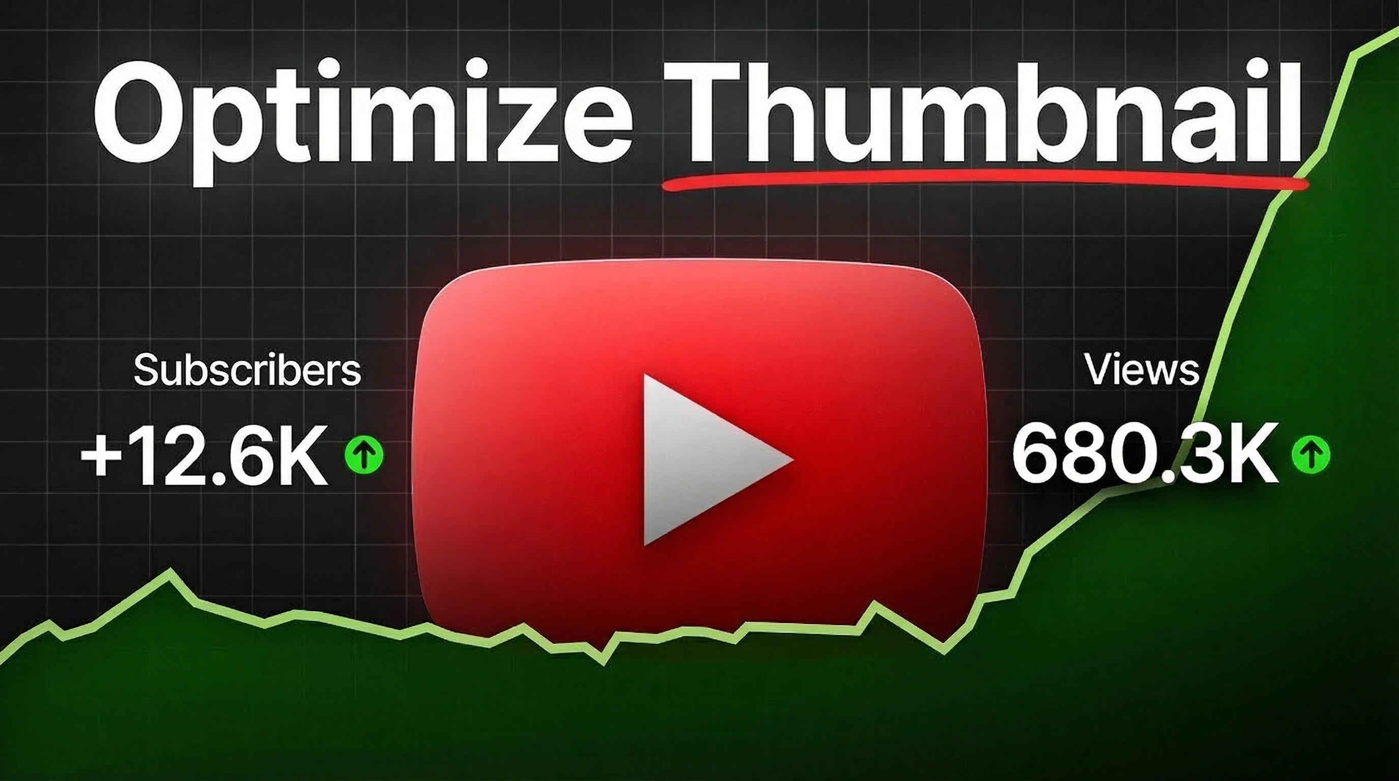
- Specs: 1280×720, 16:9 aspect ratio, under 2MB file size
- Standard CTR: Industry data suggests 2-10% is normal range
- Bottom line: Stop guessing—systematic iteration beats trial-and-error every time
A single thumbnail change can, in some cases, multiply your views by 10x or more. Yet most creators approach thumbnails through trial-and-error, hoping each design somehow performs better than the last.
The 5-step thumbnail optimization framework
Most creators redesign thumbnails randomly when videos underperform. A systematic approach replaces trial-and-error with data-driven iteration.
The framework has five stages. First, measure what currently works and what doesn't. Second, design intentionally using psychological principles rather than aesthetic preferences. Third, verify your thumbnails meet platform specifications across all devices. Fourth, run controlled tests that isolate what drives performance. Fifth, codify winning patterns into templates for consistent execution. Each stage builds on insights from the previous, creating compounding returns.
Step 1: Analyze your current performance
You can't improve what you don't measure. Start by checking your baseline numbers in YouTube Studio.
Understanding CTR and watch time
Click-through rate shows how often people click when they see your thumbnail. For diagnosing your packaging on new uploads, YouTube recommends checking CTR specifically from Home and Suggested in the first 24 hours, because those are major discovery surfaces. According to YouTube, "Half of all channels and videos on YouTube have an impressions CTR that can range between 2% and 10%." These numbers vary dramatically by niche.
But CTR alone misleads. High clicks with quick exits signal clickbait: viewers feel tricked and leave. YouTube's algorithm detects this mismatch and reduces your video's reach. Track both metrics together. The goal is thumbnails that attract relevant viewers who watch.
Identifying thumbnail weaknesses
Technical production quality doesn't guarantee clicks. One creator invested months into professional-level videos and achieved 1.8% CTR. The content was solid, but thumbnails failed to communicate value quickly enough.
Watch for these patterns:
- Overcomplicated designs with competing focal points
- Text that disappears when viewed on phones
- Visual styles indistinguishable from competitors
- No emotional signal or story preview
Pull up your last 10 uploads. Sort by CTR. What do your top performers share? Color choices, text placement, subject framing: find the common threads.
Niche-specific benchmarks
Context shapes expectations. Gaming content competes in a visual arms race of bright colors and dynamic action. Educational videos succeed through clarity and authority signals. Personal vlogs rely on authentic connection and recognizable personality.
Research on CTR prediction models across large-scale experiments reveals that visual feature optimization significantly affects click rates, particularly relevant for thumbnail design where visual elements are the primary decision factor.
Step 2: Design high-performing thumbnails
Effective thumbnail tips prioritize psychology over polish. Thumbnails are mostly about triggering the click -clarity and curiosity -with design polish playing a supporting role. Most creators over-invest in design execution and under-invest in psychological strategy.The psychology of visual attention
Visual saliency research using GANs shows these models can predict human attention patterns at human-level accuracy when trained on eye-tracking datasets. This science reveals where viewers look first and what captures attention.
Large-scale studies on image aesthetics show that despite subjective preferences, consistent visual patterns drive appeal across diverse viewer groups. Data can guide decisions rather than pure intuition.
Curiosity outperforms information. Thumbnails that answer every question give viewers no reason to click. Show enough to establish topic relevance while withholding the resolution. This gap creates the click, a key principle behind viral thumbnails.
Core design principles
These thumbnail design principles apply across niches.
Contrast and Color Bright, high-contrast thumbnails jump out from endless scroll. Muted tones disappear against interface backgrounds. Your thumbnail competes with dozens of others: it needs visual punch to register during rapid browsing.
Composition The rule of thirds creates more interesting images than center-aligned subjects, according to YouTube's own thumbnail guidance. Position key elements at the intersections of a 3x3 grid. This asymmetry adds energy and guides eye movement through the frame.
Subject Selection Research demonstrates object presence drives visual attention. Models that prioritize object detection show better saliency prediction, indicating thumbnails need clearly defined subjects to capture viewer focus.
Faces with clear emotional expressions create instant connection. The emotion becomes a question: What caused that reaction? But not every video needs faces. Product content, technical tutorials, and gameplay often perform better showing the actual subject matter.
Text overlay best practices
Limit text to 3-5 words. More text becomes illegible on mobile and clutters the composition. Text should add context to the visual, not duplicate your title.
Select bold, thick fonts with strong contrast. Elegant thin fonts vanish at thumbnail scale. Add background shapes or heavy outlines so text remains readable against complex backgrounds.
Skip the bottom-right corner: timestamp overlays cover this zone on mobile devices where most viewing happens.
Faces and emotion
Close facial shots showing strong emotion consistently outperform generic wide shots or product-only thumbnails. Emotion signals the content's tone and makes viewers curious about context.
That said, tutorials, reviews, and screen-based content often need subject-first framing. Choose based on content type and what your specific audience expects, not universal rules.
Niche-specific design formulas
Gaming Thumbnails Maximum saturation and contrast. Mid-action gameplay moments. Intense facial reactions. Text highlighting specific achievements or fails. Gaming viewers scroll fast: milliseconds matter.
Education/Tutorial Thumbnails Simple backgrounds. Clear transformations or comparisons. Visual diagrams showing the process. Text specifying the exact skill or outcome. Education viewers value credibility: polished design signals reliable information.
Vlog/Lifestyle Thumbnails Real moments over posed shots. Environmental context. Genuine facial expressions. Minimal text. Vlog viewers connect with personality: authenticity matters more than production polish.
Look beyond your niche for fresh ideas. Studying channels outside your category reveals inspiration that helps your videos stand out from competitors who all copy each other. Copying what competitors do guarantees you blend in instead of standing out.
Step 3: Technical specifications
Platform requirements aren't suggestions. Meeting these specs ensures correct display across all devices and contexts.
YouTube requirements
YouTube Help documents exact technical requirements.
Resolution: Minimum 1280x720 pixels (640 pixel minimum width). This resolution works across phone screens to 4K TVs. Important: if any thumbnail in an A/B test is below 720p, YouTube downscales all experiment thumbnails to 480p. A/B test titles & thumbnails
Aspect ratio: 16:9 recommended. Other ratios display with black letterboxing.
File formats: JPG, GIF, or PNG accepted. JPG provides best compression with acceptable quality.
File size: YouTube Help currently recommends staying under 2MB for video thumbnails (10MB for podcasts), but YouTube announced plans to expand thumbnail file-size limits up to 50MB to support 4K thumbnails on TV screens. Always confirm the current limit in Studio at upload time.
Verification requirement: Custom thumbnails require account verification. After phone verification, custom thumbnails unlock immediately for most channels, though SMS delivery can occasionally be delayed by a few minutes.
Platform-specific considerations
YouTube Shorts Shorts don't allow custom thumbnail uploads. Instead, select a frame from your Short using the YouTube mobile app. This frame appears in search results, hashtag and audio pivot pages, and your channel page. You can edit your selection after upload (in the app), but choosing during upload is the safest workflow.
Vertical Videos Standard feed vertical videos use 16:9 thumbnails most places, but these get replaced with auto-generated 4:5 thumbnails in Home, Explore, and Subscriptions sections. Your original thumbnail still appears in the watch feed, watch history, and non-mobile platforms.
Podcasts Podcast thumbnails need 1:1 aspect ratio (1280x1280 pixels) with a 10MB file size limit.
Upload Limits YouTube enforces a daily limit on custom thumbnail uploads to prevent system abuse. The specific number isn't public, but batch uploads may trigger temporary restrictions.
Mobile optimization
YouTube viewing has shifted heavily to living-room screens - internal figures cited by eMarketer put TV viewing around 45% in the U.S. Combined with mobile phones capturing most of the remaining share, thumbnail readability is a TV + phone problem: bold subjects, high contrast, and minimal text that survives both small mobile tiles and distant TV viewing.
Always check thumbnails at actual size on a phone screen. Text that looks crisp at 1280x720 in Photoshop often becomes illegible at mobile thumbnail scale in an actual feed.
Step 4: Testing your thumbnails
Data beats opinions. YouTube provides built-in A/B testing that removes guesswork.
YouTube's A/B testing feature
The "A/B test titles & thumbnails" tool tests up to 3 variations. It requires enabling advanced features in your channel settings.
Important constraints: A/B testing is desktop-only and supports testing title only, thumbnail only, or title + thumbnail combinations (up to 3 options). It's not available for Shorts, scheduled lives, premieres, or videos marked as made for kids, mature audiences, or private. If you edit the title or thumbnail during a test, the test stops automatically.
Start by publishing your video with the first thumbnail. Then open YouTube Studio, find the video, and select the A/B testing option. Upload 2 additional thumbnail variants. YouTube shows different versions to different viewers and tracks performance.
Tests run for up to 2 weeks. YouTube picks the winner automatically and shows that thumbnail to future viewers.
The three-thumbnail strategy
Test a range rather than tiny tweaks:
- Proven pattern: Your established style based on past successes
- Experimental design: A distinctly different approach
- Middle ground: Elements from both approaches combined
This spread teaches you what works while maintaining a safe fallback option if experiments fail.
MrBeast shared three thumbnail swap case studies: 10K to 700K views, 15K to 2M views, and 20K to 4M views. Thumbnail Swaps That Made Videos Go Viral The winning swaps increased perceived trustworthiness: simpler, more authentic-looking thumbnails outperformed over-produced versions.
When to swap thumbnails
Give thumbnails at least 7 days before changing them manually. Initial performance often doesn't predict long-term results: some videos take weeks to find their audience.
Consider swapping when:
- CTR falls below your channel average after 2 weeks
- Watch time is strong but CTR is weak (content is good, packaging fails)
- You've validated new design principles through A/B tests
- Seasonality changes (updating timestamps or topical references)
Avoid frequent manual swaps because you won't know what caused performance changes. If you're running an A/B test, editing the title or thumbnail mid-test stops it. Tests need time and impression volume to reach statistical significance.
Measuring success (watch time > CTR)
YouTube's A/B tests choose winners based on watch time, not click-through rate. This prevents clickbait thumbnails from gaming the system: a thumbnail that drives clicks but loses viewers quickly will lose the test.
The metric aligns creator and platform incentives. You optimize for thumbnails that attract engaged viewers, not any clicks. Better for your channel, better for viewer satisfaction.
Step 5: Scale and optimize over time
Identifying winning patterns is the start. Systematizing them creates consistent quality at scale.
Building thumbnail templates
Build reusable templates in your design tool (Canva, Photoshop, or Figma) based on your top performers. Include:
- Pre-positioned text blocks sized for mobile legibility
- Proven color palettes from high-CTR thumbnails
- Composition grids (rule of thirds guides)
- Safe zones marking UI element overlap areas
Templates eliminate starting from scratch each time. You're customizing a validated framework, not reinventing layout decisions for every video.
MrBeast emphasizes designing thumbnails during pre-production: "We sketch out the thumbnails beforehand. I'd rather have that existential crisis before I filmed the video that way I can make changes." MrBeast explained his thumbnail strategy Templates make this workflow practical even when you're not shooting custom thumbnail photography.
Brand consistency
Your thumbnails should be recognizable without reading channel names. Consistent elements build recognition:
- Signature colors and typography
- Recurring visual motifs
- Predictable framing styles (tight crops vs wide shots)
- Consistent text positioning
View your last 20 thumbnails as a grid. Do they read as a cohesive collection? Visual inconsistency signals amateur content to viewers browsing recommendations.
Continuous improvement cycle
Schedule quarterly thumbnail audits. Review your top 10 and bottom 10 videos from the past 90 days. Look for patterns.
Key questions:
- What design elements do high-CTR thumbnails share?
- What's missing from low-performing thumbnails?
- Have audience preferences shifted recently?
- What thumbnail trends are emerging in your niche?
Update templates based on findings. Optimization never ends: viewer tastes evolve, platform design changes, and competition adapts. Your framework stays consistent, but execution improves continuously.
Thumbnail creation tools
Tool choice depends on skill level, budget, and workflow needs.
Free options
Canva Template library with drag-and-drop editing. Ideal for beginners. Less flexibility than professional tools but covers 80% of use cases. Many successful creators rely entirely on Canva.
Photoshop Express Adobe's simplified mobile and web app. More power than Canva but less than full Photoshop. Good middle ground for basic compositing and text work.
GIMP Free, open-source Photoshop alternative. Steep learning curve but fully capable once mastered. Best for experienced designers who need pro features without subscriptions.
Paid/premium tools
Adobe Photoshop Industry standard for advanced work. Layer compositing, precise color control, professional finishing capabilities. Subscription required plus significant learning investment.
Figma Web-based design tool that excels at template creation and team collaboration. Component systems make variation testing efficient.
AI-powered tools
The best AI thumbnail makers offer different approaches to automation and optimization.
ThumbMagic Analyzes your existing thumbnails to identify patterns in your best performers. Generates design variations based on what works in your niche. Start with the free tier to see how AI speeds up your optimization process.
Taja AI Automated thumbnail generation from video content. Useful for high-volume channels where design time is the bottleneck.
ChatGPT Helps generate concepts and thumbnail text copy. Can't create actual images but accelerates ideation and copywriting phases.
Mobile creation tools
Mobile workflows need phone-optimized apps. Canva's mobile app covers most desktop features. Adobe Express works well on tablets. PicsArt offers mobile-specific templates designed for phone-based editing.
Common thumbnail mistakes to avoid
These errors undermine even well-designed thumbnails:
- Text overload (>5 words): Creates illegible mobile thumbnails and visual clutter. Each additional word dilutes the message.
- Poor mobile readability: Designing exclusively at desktop size ignores where 70%+ of viewers watch. Always preview at real mobile scale.
- Pixelated/low-quality images: Signals unprofessional production. Source images at 1280x720 minimum. Avoid low-resolution video stills.
- Clickbait that doesn't deliver: Thumbnails promising content the video lacks boost initial CTR but destroy watch time. YouTube learns this pattern and kills your reach.
- Inconsistent branding: Wildly different thumbnail styles confuse subscribers. They can't recognize your content in their feed, reducing loyal viewer engagement.
- Ignoring platform-specific constraints: Failing to account for Shorts' frame-only limitation, vertical video auto-generation, or mobile timestamp placement produces thumbnails that don't display correctly.
What could go wrong
Before implementing these strategies, be aware of potential issues:
- Over-optimizing for CTR alone: High click-through rates mean nothing if viewers leave immediately. YouTube's algorithm detects this mismatch and reduces your reach. A thumbnail that drives clicks but tanks watch time will hurt your channel more than a lower-CTR thumbnail that attracts engaged viewers. Always monitor both metrics together.
- Crossing into misleading territory: The line between attention-grabbing and misleading is real. Thumbnails that promise content the video doesn't deliver may boost initial performance but damage viewer trust and trigger platform policy warnings. If your thumbnail creates expectations your video doesn't meet, optimization backfires.
- Losing your brand identity: Templates and optimization frameworks help, but copying what works for others can erase what makes your channel recognizable. Subscribers should be able to identify your content in their feed at a glance. If optimization makes every thumbnail look like your competitors', you've traded differentiation for generic best practices.
- Testing without patience: Changing thumbnails every few days prevents learning what actually works. YouTube's system needs time to show your thumbnail to different audience segments. Tests require 7-14 days and sufficient impression volume to reach statistical significance. Frequent changes reset this learning, leaving you with noise instead of insights.
- Stop sign: When to abandon thumbnail optimization entirely: If your watch time drops after implementing thumbnail changes, stop optimizing and revert. If viewers consistently complain about misleading thumbnails, your optimization approach is wrong. If brand recognition suffers and subscriber engagement decreases, the framework isn't serving your specific channel needs. Some channels succeed with understated, consistent thumbnails that prioritize brand over aggressive optimization.
FAQ
How do I improve my thumbnails?
Check your current CTR in YouTube Studio. Review your top-performing thumbnails for patterns: colors, composition, text style. Create variations and test them using YouTube's A/B testing. Change one element at a time: contrast, text clarity, emotion strength, or composition simplicity. Measure results before making more changes.
Should I use faces in my thumbnails?
Faces with strong emotions create immediate viewer connection and curiosity. But product reviews, tutorials, and screen content often perform better showing the actual subject matter. Test both approaches with A/B testing to see what your specific audience responds to.
Should I use 1280x720 or 1920x1080 for YouTube thumbnails?
Use 1280x720. Higher resolutions like 1920x1080 provide no display advantage and increase file size, potentially exceeding the 2MB limit and causing upload rejection.
What are common thumbnail mistakes?
Too much text, poor mobile legibility, low-resolution images, clickbait mismatches with content, inconsistent visual branding, and ignoring platform constraints like Shorts' frame-only limitation. Most mistakes come from designing at desktop size without mobile testing.
How do I test my thumbnails?
Use YouTube's "A/B test titles & thumbnails" feature. Upload up to 3 variations. YouTube automatically rotates them and chooses the winner based on watch time, not clicks. A/B test titles & thumbnails Tests complete in up to 2 weeks. Requires advanced features enabled on your channel.
Tests end with one of three results: Winner (one variation clearly outperformed), Performed Same (no significant difference), or Inconclusive (not enough data). If your test is inconclusive, the first thumbnail you uploaded becomes the default shown to all viewers.
What is a good CTR for YouTube thumbnails?
Industry benchmarks suggest 2-10% CTR is typical for most channels. However, CTR varies widely by niche, channel size, and content type. Focus on improving your own baseline instead of hitting external benchmarks. Compare new videos against your historical average.
Can ChatGPT create thumbnails?
ChatGPT cannot generate image files. It helps brainstorm concepts, write thumbnail text, and develop strategy. For actual thumbnail creation, use design tools like Canva or Photoshop, or AI visual tools like ThumbMagic that specialize in image generation.
What tools do most YouTubers use for thumbnails?
AI tools like ThumbMagic are increasingly popular for pattern analysis and rapid variation generation. Canva dominates among beginners and intermediate creators due to its template library and ease of use. Professional creators typically use Adobe Photoshop for advanced control and compositing.
Key takeaways
A systematic framework beats random experimentation every time. The five stages (analyze, design, test, optimize, scale) transform thumbnail creation from creative guesswork into data-driven iteration that compounds over time.
Psychology matters more than technical execution. Understanding visual attention and curiosity patterns outweighs Photoshop mastery. Research on human visual processing provides scientific foundation for design principles that consistently outperform generic approaches.
Testing reveals audience-specific truth. YouTube's built-in A/B testing measures actual viewer response instead of assumptions. Watch time as the success metric ensures optimization serves viewer satisfaction, not clicks.
Technical compliance prevents display failures. Meeting specs (1280x720, proper aspect ratios, current file-size limits) ensures thumbnails display correctly across devices and contexts. Mobile optimization takes priority since most views happen on phones.