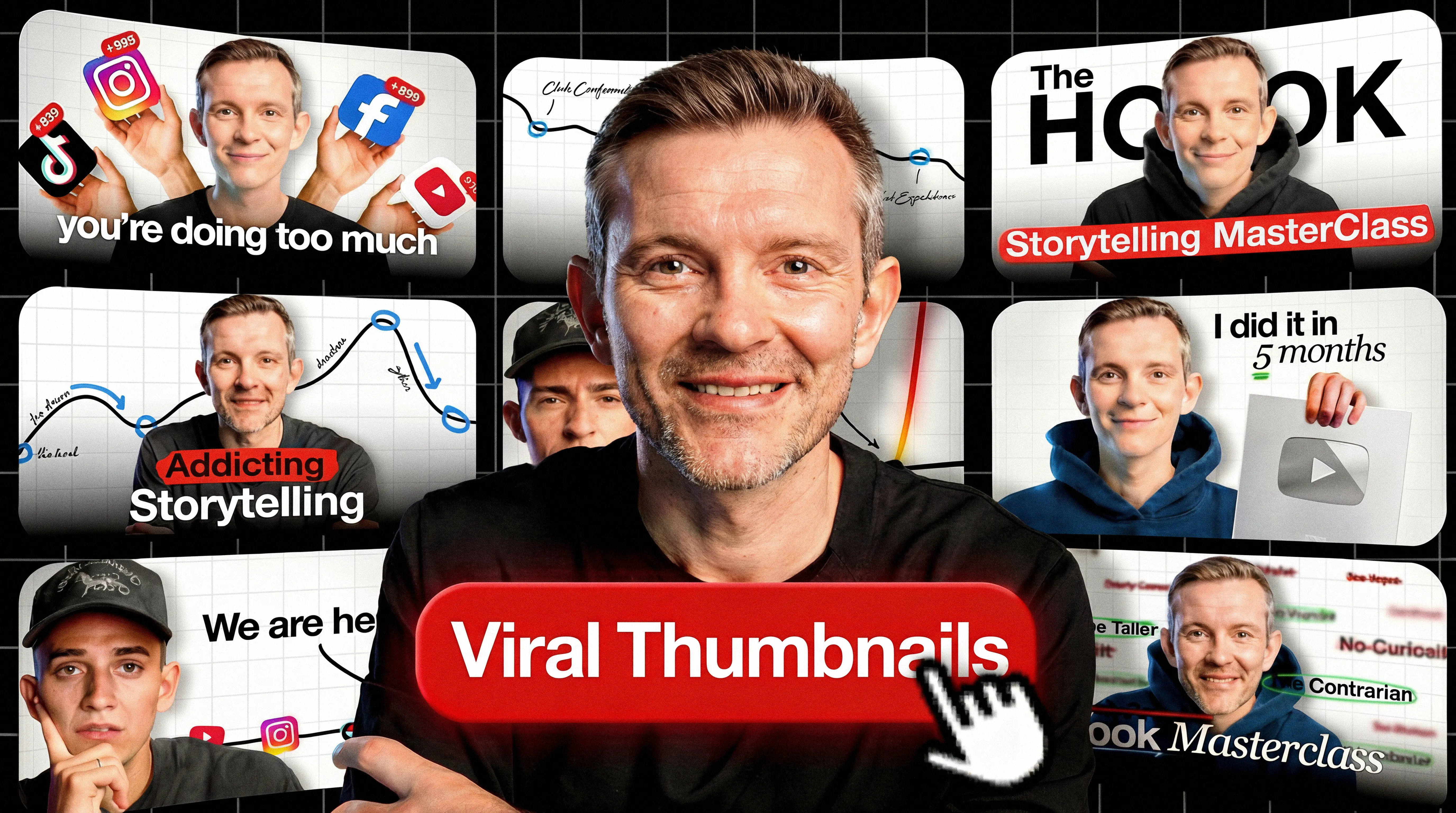
Your thumbnail has a split-second to stop the scroll. That instant decision determines whether viewers click or pass, and YouTube's algorithm notices.
But what separates thumbnails that go viral from the millions that get ignored? The answer lies in understanding both the psychology of attention and the practical design principles that work at every screen size.
Viral thumbnails share common traits: they create curiosity gaps, use contrast that pops on mobile, and match viewer expectations just enough to feel familiar while breaking patterns enough to stand out. These principles apply whether you're a gaming creator, educator, or vlogger. Understanding your CTR (click-through rate) benchmarks helps you measure whether your thumbnails actually perform.
This guide covers the cognitive psychology behind viral thumbnails, 12 proven thumbnail formats, design principles that hold up at mobile size, and testing methods to find what works for your specific niche.
TL;DR:
- Psychology drives clicks: Semantic distinctiveness and pattern interruption make thumbnails memorable
- Mobile/TV-first: Design for small screens (mobile) and far-away screens (TV is now primary in the U.S.)
- Simplicity scales: Keep to 3 primary elements max—complexity disappears at mobile size
- Bottom line: 90% of top videos use custom thumbnails—A/B test to find what works for your niche
Quick steps:
- Choose a thumbnail type (burning question, before/after, reaction, comparison, etc.)
- Apply one psychology principle (curiosity gap, pattern interruption, or distinctiveness)
- Design at 1280×720 with bold, concise text overlay
- Preview on an actual phone to verify legibility
- Upload and monitor CTR in first 24 hours
- A/B test variations using YouTube Studio
- Refresh style when performance patterns decline
Why viral thumbnails work: The psychology of clicks
Note: These are useful design heuristics, not guaranteed effects - treat them as hypothesis generators for testing.
Viral thumbnails often draw on cognitive psychology principles that may make images harder to scroll past. Research on social media images (not YouTube-specific) shows memorable images predict engagement even after controlling for image categories source. This suggests a hypothesis for thumbnails: semantic distinctiveness (unexpected combinations that stand out) may matter more than emotional intensity alone.
What YouTube explicitly recommends vs. what creators commonly observe
| YouTube says | Creators report |
|---|
| Use custom thumbnails (90% of best-performing videos do) | Faces often boost CTR in personality-led niches |
| Monitor CTR on Home/Suggested in first 24 hours | Red backgrounds may outperform (anecdotal) |
| A/B tests pick the winner by watch time, not CTR | Simpler designs hold up better at small sizes |
| Don't mislead viewers (hurts watch time) | Pattern interruption beats imitation |
The table shows what YouTube explicitly documents versus patterns creators report. Use official recommendations as your foundation; test creator heuristics carefully.
Curiosity gaps: Incomplete information creates tension
The Zeigarnik effect - the idea that people remember unfinished tasks better than completed ones - is a commonly used heuristic in thumbnail design. Many creators use partial information or mid-action shots to generate curiosity. A thumbnail with someone's mouth open mid-sentence or a product half-revealed creates tension that viewers may resolve by clicking.
Learn more psychological principles in our guide on how to make thumbnails.
Use cropped images, cut-off text, or paused moments. A gaming thumbnail showing a character frozen mid-jump makes viewers wonder what happens next.
Pattern interruption: Breaking viewer expectations
Your thumbnail competes with dozens of similar videos. Pattern interruption means doing the opposite of what viewers expect in your niche. If educational channels use white backgrounds, try bold color. If gaming channels show gameplay, show reactions instead.
One YouTuber reported CTR jumping from 5% to 8% after removing their face and using recognizable imagery instead source. The shift broke their pattern and stood out in feeds. (This creator also noted better performance in personality-led niches when using recognizable subject matter instead of faces.) Your results will vary. Treat anecdotes as inspiration, not benchmarks.
Emotional contagion: Why faces often work
Creators in personality-led niches report faces help - the theory is that viewers mirror emotions they see. Some niches perform better with product shots or landscapes. Test both approaches for your content.
If you're camera shy: Use recognizable objects, mascots, or product close-ups. The emotional hook can come from the subject matter, not your expression.
Distinctiveness: Stand out or get ignored
The Von Restorff effect - items that differ from surroundings get remembered - often aligns with what creators observe in thumbnails. This is why bright colors work on neutral backgrounds.
A tutorial thumbnail using neon green text on gray stands out in a sea of red and yellow. Distinctiveness beats convention.
Cognitive load theory: Simplicity wins
The brain processes simple images faster than complex ones. The "3 elements max" rule of thumb is common advice - test it for your niche. High contrast reduces cognitive load and improves legibility at small sizes.
A YouTuber with 1.8M subscribers summarized it: "3 elements max in the thumbnail. High contrast. Clear curiosity" source.
12 thumbnail types that drive clicks
Study your niche's visual conventions, then add one distinctive element to stand out.
State the burning question
State the question viewers already ask. "Why did X fail?" or "How does X work?" The visual shows evidence of the question: something unexpected or confusing that demands explanation.
Show before-and-after transformations
Split screen showing transformation. Left side: starting point. Right side: result. Any content with visible change works: tutorials, makeovers, experiments. The contrast creates instant curiosity.
Capture close-up reactions
Extreme close-up showing intense emotion. Works when emotion matches content. Shock for revelations. Confusion for paradoxes. Excitement for successes.
Versus comparisons
Two options side-by-side with "VS" between them. Gaming channels compare weapons. Tech channels compare products. Review channels compare services. The format promises to help viewers decide.
Use high-energy action shots
Mid-motion freeze frames: jumping, exploding, celebrating. Conveys intensity through implied movement. Gaming, sports, and adventure content use this format heavily.
Feature products prominently
Product-focused shot with simple background. Often includes price or key feature as text. Reviews and e-commerce channels rely on this format.
Capture emotional moments
Genuine emotion: authentic laughter, tears, surprise. Unlike posed reactions, these capture real moments from content. Vlogs and documentaries benefit most from this approach.
Show tutorial results
Shows end result plus key tools or ingredients. A finished dish with three main ingredients. A completed drawing with the pen used. Communicates value and method in one frame.
Display facts and stats
Large text with surprising number. "67% don't know this" or "$1,800 saved annually." Specificity adds credibility while creating curiosity.
Pull quotes or sound bites
Pull the most provocative line from your content. Short, high-contrast text over relevant background. Commentary and interview content uses this effectively.
Use humor or satire
Unexpected juxtaposition or absurd visual. Meme-style humor or ironic contrast. Higher risk because humor is subjective, but high reward when it lands.
Use stunning visuals
Pure aesthetic appeal. Beautiful landscapes, artistic compositions, striking imagery. Travel, photography, and art channels rely on visual quality as the primary draw.
Quick reference: Thumbnail type chooser
| Type | Best for | Template | Common failure mode |
|---|
| Burning question | Explainers, mysteries | "Why did X...?" | Question too generic |
| Before/after | Tutorials, transformations | Split screen with change | Difference not visible at small size |
| Reaction close-up | Commentary, reactions | Extreme close-up, big emotion | Expression too mild |
| Versus comparison | Reviews, comparisons | "X vs Y" side-by-side | Too cluttered |
| Action shot | Gaming, sports, adventure | Frozen mid-motion | Blurry or unclear subject |
| Product focus | Reviews, unboxings | Product + price/feature | Looks like an ad |
| Emotional moment | Vlogs, documentaries | Genuine emotion capture | Posed rather than authentic |
| Tutorial result | How-to, recipes | End result + key tools | Result not impressive enough |
| Stats/facts | Educational, data-driven | Large surprising number | Number not specific enough |
| Quote/soundbite | Interviews, commentary | Provocative text over background | Text too long |
| Humor/satire | Comedy, commentary | Unexpected juxtaposition | Humor too niche |
| Stunning visual | Travel, photography, art | Pure aesthetic appeal | No clear subject |
Do this now: Pick one thumbnail type that matches your next video's goal. Use it as your starting template, then add one element to stand out from competitors using the same format.
Thumbnail design principles that scale across devices
Color psychology that works
Color choice matters less than color contrast relative to surroundings. A blue thumbnail stands out in a feed of red thumbnails. Check what your competitors use, then diverge.
One YouTuber analyzed their own thumbnails and reported red gradient backgrounds outperformed other colors source. Red signals urgency and captures attention. However, avoid red for text and UI elements - it blends with YouTube's interface. The takeaway: red backgrounds may work; red text doesn't. Test with your audience.
Text overlay: The 3-5 word heuristic
Mobile viewers cannot parse lengthy text. Practitioners recommend limiting overlays to 3-5 words. Use oversized bold fonts with maximum contrast against backgrounds.
Add shadows or outlines to improve readability across varied brightness levels.
Community feedback consistently identifies illegible small-size text as a failure point. Test thumbnails at 10% scale before uploading to simulate mobile viewing.
Contrast and visual hierarchy
Direct viewer attention through deliberate contrast application. The focal point (your primary element) receives highest contrast and largest size. Secondary elements receive reduced emphasis.
Backgrounds should recede, not compete. Apply blur, desaturation, or darkening to push backgrounds away from primary focal points.
Avoid the bottom-right corner for text. YouTube's duration badge sits there and will obscure anything you place in that area. Keep key text and faces away from the lower-right quadrant.
Try this: Blur your thumbnail. If you can still identify the focal point instantly, your hierarchy works.
Mobile-first design (and TV considerations)
Mobile has long been a major viewing surface; in the U.S., TV is now the primary device (by watch time, as of Dec 2024) source. Regardless, your thumbnail displays much smaller on phone screens than desktop previews suggest. Exact dimensions vary by surface and device.
Vertical video gotcha: Vertical videos using 16:9 custom thumbnails can have their thumbnail replaced with an auto-generated 4:5 thumbnail on Home, Explore, and Subscriptions feeds (mobile), while your custom thumbnail still appears in other contexts like search source. Factor this into design decisions if you create Shorts or vertical content.
Desktop-effective elements often become unreadable on mobile. Design to be legible at small sizes. Increase font sizes. Reduce complexity. Preview at mobile scale before publishing.
Background design and simplicity
Simple backgrounds allow foreground elements to dominate. Solid colors, subtle gradients, or heavily blurred photos work best. Detailed backgrounds compete for attention and reduce legibility.
For additional optimization strategies, explore these thumbnail tips.
Best AI and design tools for viral thumbnails
AI tools excel at speed; traditional tools offer more control.
AI thumbnail generators
Purpose-built AI tools generate thumbnail variations from text prompts in seconds. They trade pixel-perfect control for speed and volume, useful when you need to test multiple options quickly. (Features may change; check vendor sites.)
Pikzels
Generates thumbnails from text prompts without templates. Offers AI scoring features intended to help iterate faster. Good for creators who want feedback on their designs.
Thumbmagic
Generates multiple thumbnail variations from text prompts quickly. Best for creators who need volume and fast iteration. (Disclosure: Thumbmagic is the publisher of this guide.)
OpusClip
May auto-generate thumbnails from video highlights and suggest high-impact frames. Best when your video contains strong visual moments.
General-purpose AI tools can struggle with thumbnail-specific composition and style; dedicated tools tend to ship more on-brand starting points.
AI ethics note: When using AI thumbnail tools, avoid copying identifiable creator artwork, styles, or likenesses too closely. Some AI thumbnail tools have faced backlash for generating content that mimics specific creators' visual styles without consent source. Use AI as a starting point, then customize to create something original.
Traditional design tools
For creators who want pixel-perfect control.
Photoshop vs AI tools: When to use each
Photoshop: Full control, steeper learning curve, often 10+ minutes per thumbnail depending on complexity. Best for creators with design experience who need exact specifications.
AI tools: Limited control, instant generation, typically under a minute per thumbnail. Best for creators prioritizing speed over customization.
Free vs paid tools
Free options (Canva Free, GIMP, Thumbmagic free tier) work for most creators. Paid tiers add features like unlimited exports, advanced templates, or team collaboration.
Start free. Upgrade only when you hit feature limits.
Step-by-step: Creating your first viral thumbnail
1. Identify your niche and target audience
Study top performers in your specific niche to understand visual conventions.
2. Choose your thumbnail type (from the 12 types)
Match thumbnail type to content objective. Tutorial content? How-to format. Debate content? Versus comparison. Mystery content? Burning question format.
3. Apply psychological principles
Incorporate curiosity gaps (incomplete information that creates tension). Apply pattern interruption to differentiate from competitors. Add emotional triggers when appropriate for niche context.
4. Design with mobile in mind
Preview on an actual phone. If elements become invisible or text illegible, simplify. Remove non-essential details.
5. Add text overlay
Follow the 3-5 word heuristic (see Text Overlay section). Use bold typography with high contrast.
6. Upload and monitor CTR
What to check in the first 24 hours:
- CTR on Home + Suggested feeds: YouTube explicitly recommends measuring CTR on these surfaces in the first 24 hours source
- Subscriptions feed CTR: Check separately if you want to gauge subscriber engagement
- How impressions are counted: An impression counts when a thumbnail is visible for more than 1 second and at least 50% visible source
Monitor these metrics through YouTube Studio analytics.
Technical specifications:
- Resolution: 1280×720 pixels maintaining 16:9 aspect ratio (source)
- Supported formats: JPG, GIF, PNG (source)
- Size limit: Under 2MB for videos (10MB for podcasts) (source)
- Requirement: Account verification necessary for custom thumbnail uploads (source)
Pre-publish checklist:
- Preview at mobile size (10% scale or actual phone) - can you read the text?
- One clear focal point - blur the image and check if it's still identifiable
- Title and thumbnail work together (they shouldn't repeat the same info)
- Check against YouTube's thumbnail policy source
- Compare against competitors - does yours stand out in the feed?
How to test and optimize thumbnails for CTR
One YouTuber reuploaded a video that got 100 views with a new thumbnail. It hit 1,000 views in 24 hours and retention jumped from 9% to 65% source. Results like this are not typical - treat as inspiration.
A/B test your thumbnails
YouTube's "A/B test titles & thumbnails" feature lets you test up to 3 options (thumbnails and/or titles) source. YouTube's A/B testing optimizes for overall watch time; results are reported as watch time share. The "winner" balances CTR and retention - not CTR alone (source). Possible outcomes include Winner, Performed Same (variants performed similarly), or Inconclusive (insufficient impressions). If there's no clear winner, YouTube shows your first uploaded option by default (source).
Control group note: YouTube may keep a small percentage of viewers as a control group who only see your default thumbnail/title. Their performance is excluded from the experiment calculations (source).
Packaging = thumbnail + title. Your thumbnail is the visual promise; your title is the verbal promise; your video is the delivery. YouTube's test feature covers both (source). If discovery is your bottleneck, test title variations too, not just thumbnails.
Change one variable per test. Testing multiple changes at once tells you a winner but not why it won.
What to test first (priority order):
- Face vs no face
- Tight crop vs wider context
- Curiosity text phrase (3-5 words)
- Background color/value contrast
- Layout (left/right subject placement to avoid duration badge)
Available desktop-only via YouTube Studio (source). Tests typically complete within two weeks (source). Eligibility: requires advanced features; not available for Shorts, Scheduled Lives, Premieres, private videos, made-for-kids, or age-restricted content (source).
Resolution warning: If any thumbnail is lower than 720p, all experiment thumbnails will be downscaled to 480p (source).
Note: If you change a video's title or thumbnail during the test, the test automatically stops. More on A/B testing.
Test plan template:
- Variants: 3 options (thumbnail only, title only, or both)
- Variable: Change ONE element per test (face vs no face, color, text)
- Expected outcome: Winner by watch time share, or "Performed Same" / "Inconclusive"
- If inconclusive: First uploaded option becomes default; consider testing bolder variations next time
Read CTR data
Good CTR varies by niche, channel size, and content type - compare against your own baseline across multiple videos. See our CTR benchmarks guide for context on what different niches typically achieve.
Quick CTR diagnostics:
- High CTR + low retention: Thumbnail/title overpromise - make your promise more accurate
- Low CTR + high retention: Packaging unclear - simplify, add stronger contrast or curiosity
- Low CTR + low retention: Topic or execution issue - revisit your concept or hook
Recognizing and addressing thumbnail fatigue
Consistent branding helps recognition. Identical layouts become invisible. Balance consistency (colors, fonts, overall style) with variety (subjects, emotions, specific elements).
One YouTuber who reached 25M views put it this way: "You need to package your videos in a similar fashion time and time again where the thumbnails have a consistent theme" source.
When to refresh:
- CTR declines over 3+ consecutive videos
- You shift content focus to a new niche
- Major competitors change their style
- Audience feedback indicates thumbnails "all look the same"
How to rotate: Change one element per video while keeping the framework stable. Swap background colors. Try a different expression. Vary text placement. Test systematically.
Do this now: Open YouTube Studio and check your last 5 videos' CTR. If any are below your channel average, swap the thumbnail using insights from this section.
Common thumbnail mistakes that kill your click-through rate
These errors often hurt CTR and can erode watch time:
Too much text (unreadable on mobile)
Keep text concise (see Text Overlay section). Test mobile preview before publishing.
Low contrast (doesn't stand out)
Thumbnails with poor contrast blend into feeds. Use high-contrast color pairs. Increase separation between foreground and background.
Generic emotions (no distinctiveness)
Slight smiles and neutral expressions lack impact. Use exaggerated emotions or skip faces entirely. Semantic distinctiveness can improve memorability more than mild emotion.
Clickbait that erodes trust
Thumbnails that misrepresent content attract viewers who immediately leave, damaging retention. Stay honest. See our thumbnail optimization tips for more guidance.
Ignoring niche conventions
Every niche has visual language. Gaming uses high saturation and action. Finance uses charts and professional headshots. Education uses clean backgrounds and clear text. Violating niche norms confuses viewers about content type.
Policy violations from aggressive designs
YouTube may remove content or restrict distribution for misleading thumbnails, sexually suggestive imagery, or violent content (source). Check your thumbnail against Community Guidelines before publishing.
FAQ
Best size for YouTube thumbnails
1280x720 pixels, 16:9 aspect ratio, max 2MB source.
Faces in thumbnails
Faces help in personality-led niches; product shots or landscapes work better for tutorials and travel content. Test both.
Text limits for thumbnails
3-5 words max, oversized bold fonts with high contrast. Test at 10% scale to simulate mobile.
Best colors for viral thumbnails
Contrast matters more than specific colors. Check what competitors use, then diverge.
Free viral thumbnail tools
Canva, GIMP, and Thumbmagic all offer free tiers sufficient for most creators.
How do I A/B test thumbnails?
Use YouTube Studio's desktop-only feature to test up to 3 options. Tests complete within two weeks.
Do thumbnails affect watch time?
Accurate thumbnails attract viewers who actually want your content - they stay longer, improving retention.
How often should I change my thumbnail style?
Refresh when CTR declines over 3+ consecutive videos or audience feedback says thumbnails "all look the same."
Creator anecdotes: Reddit sources cited inline represent individual creator experiences, not verified benchmarks. Use as inspiration, not prediction.
Key takeaways
- Semantic distinctiveness can improve memorability - unexpected visual combinations may outperform mild emotion
- Apply the 3-5 word text heuristic and test thumbnails at mobile size for legibility (mobile and TV are major viewing surfaces)
- Use the 12 thumbnail types framework to match thumbnail style to content goal
- AI thumbnail generators reduce design time while expanding creative options. Test multiple variations to find what works
- YouTube's A/B testing picks winners by highest share of watch time, not CTR. Design thumbnails that attract the right viewers source
- Pattern interruption beats imitation. Study your niche then diverge to stand out in feeds
Apply pattern interruption to your next thumbnail. Test multiple variations and A/B test winners. Try Thumbmagic free to generate options quickly.